As this was a personal project, we were allowed to develop our own project around our own interests, in the format of either dissertation or artifact. I selected artifact, as this would allow me to explore art and photography in a practical manner, which is what I enjoy doing best. I would need to conduct all the planning and development for the project keeping to deadlines that I needed to make myself, which I was nervous about as timekeeping and organization are not my strong points. This is the first practical project that I have worked on individually with no group or clients, which was daunting but also allowed me to explore my interests without the influence of others. At the beginning of the project we had to fill out a proposal form stating what we wanted to gain from the project, materials we would need and a timescale to which we could work to. The project title had to be in the format of a question, which I struggled to produce as it was so early on in the project and I was unsure of what I wanted to explore.
I had a rough idea of the route I wanted to take in the project that was based around art and photography. I initially wanted to produce a series of portraits using both mediums but had to come up with a topic to base them on. The idea of celebrities was my initial thought, possibly recreating famous portraits of celebrities, however I thought this would be too vague and could possibly go off track. I have always been interested in cult celebrities and their deaths, so I thought I could include this in my work. The other ideas I had included product placement in either advertising campaigns or famous images. This could have included controversial links with companies such as the use of child labour or corrupt use of ingredients. I decided to take advantage of the personal project by selecting the topic of cult celebrities, as this would allow me to put my knowledge into art.
Conducting research on various artists in the pop art and dada genre gave me some inspiration for the pieces I wanted to create. Looking at Rauschenberg in particular gave me the idea for my first piece that was based on the death of John F Kennedy. I wanted to tell the story of his assassination and the events that occurred after; the arresting of the gunman Harvey Oswald, his public murder by Jack Ruby, and then his death days before his trial. There was no other pieces or art or media that covered the same topic and in the same way so I felt this to be a particularly strong idea. My interest in The Beatles was the reason for my second final piece. Along the same subject of death, I wanted to take the famous Abby Road cover and alter it in a way to covey a controversial message about John Lennon’s assassination. The band member was shot outside his hotel room by a stalker named Mark Chapman, which I wanted to state in my art piece using a graffiti style image over the top of the original, to look as If it had been defaced. The idea came from my interest in graffiti artists such as Banksy, but it has never been used as a small element within a piece before so this proved to be another strong idea. The difference in arrangement of the pieces is that my JFK composition tells a story by laying out different elements of the story in order to make it easy to understand, whereas my Abbey Road article is ore of a statement piece and would probably only be understood by people who had knowledge on Mark Chapman and Lennon.
There are many different techniques that I have covered within my two compositions. The main techniques I covered were lino and dry point printing, that involved me cutting and scratching into different materials and printing them using both oil and water based inks. I believe that these two elements of my JFK piece are strong as the prints are unique versions of existing images. The main element of my Abbey Road image is the two graffiti style silhouettes featured in the place of John Lennon. The overall look is very simple but required a lot of work both hand drawing and Photoshop. I began by finding an image of a policeman escorting a man, and by pasting Mark Chapman’s face on the body and blending it I was able to create my base image. I then removed the background and used the ‘stamp’ filter on Photoshop on the image to separate it into black and white sections. By doing this I was able to hand draw the image using the previous Photoshop image to decipher where to place the lines. A problem I found when creating both pieces of work was how to take existing images and appropriate them in a way that would not be breaching copyright rules, and editing them enough to make them my own. I think I achieved this in my JFK piece as most images have had more than more than one process done to create them, however the main base image of my Abbey Road piece is still too similar to the original. If I created this piece again I would completely recreate the background from scratch. I put both compositions together using Photoshop as I could then alter the sizes of each element and place them exactly where I wanted. If I could do my JFK piece again I would have thought more about the sizing of each element and created it all by hand as I feel the sections look more authentic as hard copies.
Wednesday, 4 May 2011
Wednesday, 9 March 2011
JFK
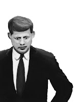
The first element i needed in this piece is a portrait of JFK. This would be the first image i used in the collage to make it clear from the beginning what the piece was about. I created this using oil pastels and i feel it turned out well
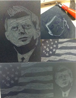
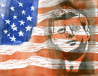
As i wanted to use a different technique in every element of the collage, i decided to use the skills i had learned in lino printing to create a section. I began by cutting out an American flag on one piece of lino, and an image of JFK in another. I created the JFK lino cut by editing an image of Kennedy at a conference on Photoshop, using the stamp tool to separate the image into black and white. I had used this filter when creating my Beatles piece also. I then printed these using ink in different orders and colours to experiment. I chose this print as i feel it was most similar to Rauschenberg's silkscreen prints.
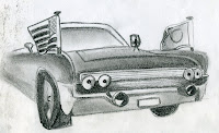
I researched Kennedy's death and discovered he was shot whist riding in a 1964 Lincoln Continental and decided to include this in my piece. I drew the image using sketching pencils
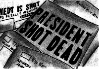
I wanted to incorporate news articles into this piece also, this is an appropriated image of a pile of newspapers. I created it by redrawing it using felt tips to create the outline, and then scanned it and used a combination of filters on Photoshop
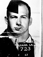
This is my second portrait incorporated in my collage. I wanted to portray Lee Oswald as what he used to be before he went to prison. I did this by combining an image of him as a soldier, and his mugshot; I felt as if this would be powerful. I created this on Photoshop by placing half of each image together and using the blend tool to merge them together
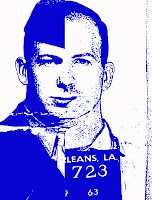
I experimented with lost of different filters on photoshop. I decided i wanted to make it blue as i feel it would balance out the red of the cigarette packet, and fit in with the colour theme.
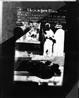
I wanted to incorperate dark room work into my peice. I created this by printing off various images revolving round Lee oswalds death, including the famous image of the shooting, and aranging them into one image. I then placed this on top of a peice of photographic paper and exposed it to light using an enlarger and developed it.
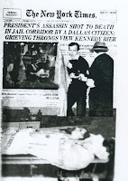 I experimented with different techniques such as covering sections and combining negative and positive images. I also experimented with textures by ripping and screwing up the original image before I printed. I chose to use the positive image a i feel its simple and works well and is easier to look at as a section.
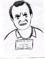 The third portrait in my collage is inspired by David Hockney, as i have been studying him in another project. I wanted it to be similar to his ink portraits and i feel i managed this well. I experimented with different pens and pencils and felt the ink pen worked best. As the mugshot i used for inspiration was simple i wanted to continue this when recreating this.
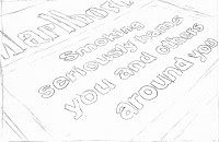
Jack ruby died of lung cancer days before he was going to be sentanced to death for murdering Lee oswald. I researched the subject and discovered that he had died of lung cancer by second hand smoke and decided it would be appropriate to include a cigarette packet with a message on the front.
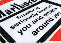
I created this using colouring crayons to draw the general packet. I also experimented with water colours but didn't get the vivid colour i needed. Instead of writing the message out, i wanted the image to look as realistic as possible so i layered a picture of the message and used Photoshop to place the message onto the image.

This is the draft of my final piece. I arranged the different elements into an order so they told the story of the chain of events leading from JFK's death. I scanned each part and arranged them on Photoshop instead of putting each piece together manually, as i was able to experiment with the sizes of the parts and fit them together.
Abbey road
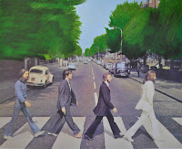 This was my first experiment with the Abbey road cover. I wanted to alter insignificant elements of the image to include different techniques and mediums. This was an experiment using oil pastels to recreate the trees. i created this by printing out the image and using oil pastels over the top. I think it worked well as it added texture to the image without making the image unrecognisable.
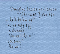 I wanted to incorporate some of John Lennon's lyrics onto the piece as it revolves around him. I chose these lyrics as they mention heaven which relates to death. I scanned in a piece of blue dotted paper to use as a background texture and wrote the lyrics on using a downloaded font.
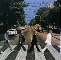
I arranged the words to fit in the sky behind the trees, so the most important words are visible. I then erased the words that were partly hidden to make the image look neater. I decided to place the lyrics in the sky as it relates back to the lyrics used and i feel it works well as it adds a softness to a dark concept.

I used Banksy's controversial graffiti as inspiration for the abbey road piece. I wanted to replace John Lennon with a policeman escorting his killer away. I did this by finding images on the internet of a policeman and used Photoshop to combine the image with n image of mark Chapman. I then applied the stamp filter to separate the image into black and white.
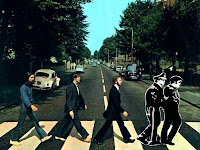
I used the clone tool on Photoshop to remove Lennon from the image and then layered the image of Mark chapman on top, after drawing it myself and scanning it in. I experimented with how the print should be displayed and decided to include a white outline around the print to make it stand out.
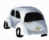
I wanted to try and incorporate many different mediums in the peice. I had already included Photoshop and drawing and experimented with oil pastels, but wanted to extend on this further. I decided to try out oil pastels again and decided to replace the Beetle car int he image with one i created. I drew the Beetle with oil pastels and layered it over the top of the original.
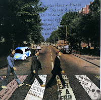
After placing the car within the image i decided to go back to the idea of placing newspaper articals within the zebra crossing stripes. I wanted to replace the general newspaper cut outs that i had stuck on, with more apropriate items. I found articals of Lennons death on the internet and pasted them into place and arranged them so the most important information was portrayed. I feel it works well as It makes the idea of the piece clear
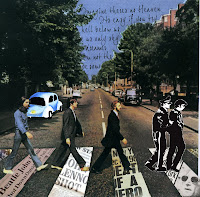
This is the first draft of my final piece. I believe all the separate elements work well together and i think the idea behind the piece is clear. I am not sure about the car as i don't feel it has enough meaning within the image, however i think it fits in the image as a whole.
Wednesday, 12 January 2011
Final Piece ideas
1.John F Kennedy
I want to incorporate all the characters in the chain of deaths proceeding after John FK was shot. This includes JFK, Lee Oswald and Jack Ruby. I also wanted to include the subject of Jack Ruby escaping the death penalty in jail by dieing of cancer.I would like to use a mix of newspaper images and paint to create the image, in the style of Rauschenberg.
2.John Lennon
I want to appropriate the famous Abbey Road album cover to express John Lennon's murder. I wanted to use graffiti style painting over the top of the image to express the story of his murder his murderer, Mark Chapman, and a police man.
Monday, 10 January 2011
Peter Blake
Peter Blake is a leading figure in British pop art who emerged in the period of mass production of products and images such as magazines and record sleeves. Blake's work is also inspired by love affairs between icons. 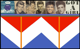 'Got a girl' is based on the song about girlfriends obsessions with Fabian, Avalon, Ricky Nelson, Bobby Rydel and Elvis. The piece is a combination of collage and silkscreen
 'Got a girl' is based on the song about girlfriends obsessions with Fabian, Avalon, Ricky Nelson, Bobby Rydel and Elvis. The piece is a combination of collage and silkscreen
Peter Kennard
Peter Kennard's work reflects his involvement in the anti-Vietnam war movement. his photo montages are "full of histories irony, fury and anger at the mistakes made in its name"The base of his work is rendering iconic and easily accessible images unacceptable, using controversial images placement.
"there is a natural alliance between truth and affliction" - Simon weil.
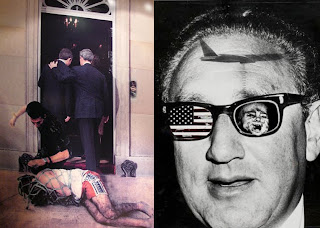
"there is a natural alliance between truth and affliction" - Simon weil.

Robert Rauschenberg
Robert rauschenberg served in the military in the 1940's which was an obvious inspiration for his political and cultural art. He uses images of current and symbolic events out of magazines and the media in his collages, expanding them with 3d objects, also using techniques such as painting with ink dipped tyres. Rauschenberg used a large press still of JFK from a televised news conference, juxtaposing it next to an image of an astronaut which gives the piece a time frame and allows the viewer to read a story.

James rosenquist
James rosenquist is an American artist who combines both pop art and fine art. He creates his work using techniques such as silkscreen printing and collage. His collages are composed in a way that the individual objects make sense together and tell a story. His print 'president elect' uses the image of Kennedy's face from his campaign poster, which is another example of appropriation. Rosenquist said he was interested in people who advertise themselves.
 His collages are composed in a way that the individual objects make sense together and tell a story. His print 'president elect' uses the image of Kennedy's face from his campaign poster, which is another example of appropriation. Rosenquist said he was interested in people who advertise themselves.
Andy warhol
Warhol's silkscreen Monroe prints are another example of appropriation. The original image is a publicity shot from the 1953 film Nigeria.

These prints undermined the authenticity of the original portrait and allows the image to be reproducible. Warhol had an obsession with morbid concepts and cult celebrities. I am interested in exploring the fate of these cult celebrities if they had the chance to burn out like the celebrities with no controversial story.

These prints undermined the authenticity of the original portrait and allows the image to be reproducible. Warhol had an obsession with morbid concepts and cult celebrities. I am interested in exploring the fate of these cult celebrities if they had the chance to burn out like the celebrities with no controversial story.
Subscribe to:
Comments (Atom)