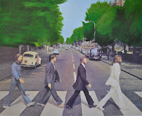
 This was my first experiment with the Abbey road cover. I wanted to alter insignificant elements of the image to include different techniques and mediums. This was an experiment using oil pastels to recreate the trees. i created this by printing out the image and using oil pastels over the top. I think it worked well as it added texture to the image without making the image unrecognisable.
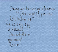 I wanted to incorporate some of John Lennon's lyrics onto the piece as it revolves around him. I chose these lyrics as they mention heaven which relates to death. I scanned in a piece of blue dotted paper to use as a background texture and wrote the lyrics on using a downloaded font.
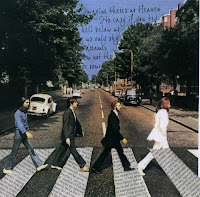
I arranged the words to fit in the sky behind the trees, so the most important words are visible. I then erased the words that were partly hidden to make the image look neater. I decided to place the lyrics in the sky as it relates back to the lyrics used and i feel it works well as it adds a softness to a dark concept.

I used Banksy's controversial graffiti as inspiration for the abbey road piece. I wanted to replace John Lennon with a policeman escorting his killer away. I did this by finding images on the internet of a policeman and used Photoshop to combine the image with n image of mark Chapman. I then applied the stamp filter to separate the image into black and white.
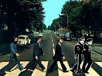
I used the clone tool on Photoshop to remove Lennon from the image and then layered the image of Mark chapman on top, after drawing it myself and scanning it in. I experimented with how the print should be displayed and decided to include a white outline around the print to make it stand out.
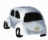
I wanted to try and incorporate many different mediums in the peice. I had already included Photoshop and drawing and experimented with oil pastels, but wanted to extend on this further. I decided to try out oil pastels again and decided to replace the Beetle car int he image with one i created. I drew the Beetle with oil pastels and layered it over the top of the original.
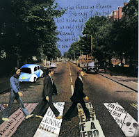
After placing the car within the image i decided to go back to the idea of placing newspaper articals within the zebra crossing stripes. I wanted to replace the general newspaper cut outs that i had stuck on, with more apropriate items. I found articals of Lennons death on the internet and pasted them into place and arranged them so the most important information was portrayed. I feel it works well as It makes the idea of the piece clear
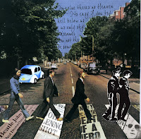
This is the first draft of my final piece. I believe all the separate elements work well together and i think the idea behind the piece is clear. I am not sure about the car as i don't feel it has enough meaning within the image, however i think it fits in the image as a whole.
